All work
HospitalityPublic
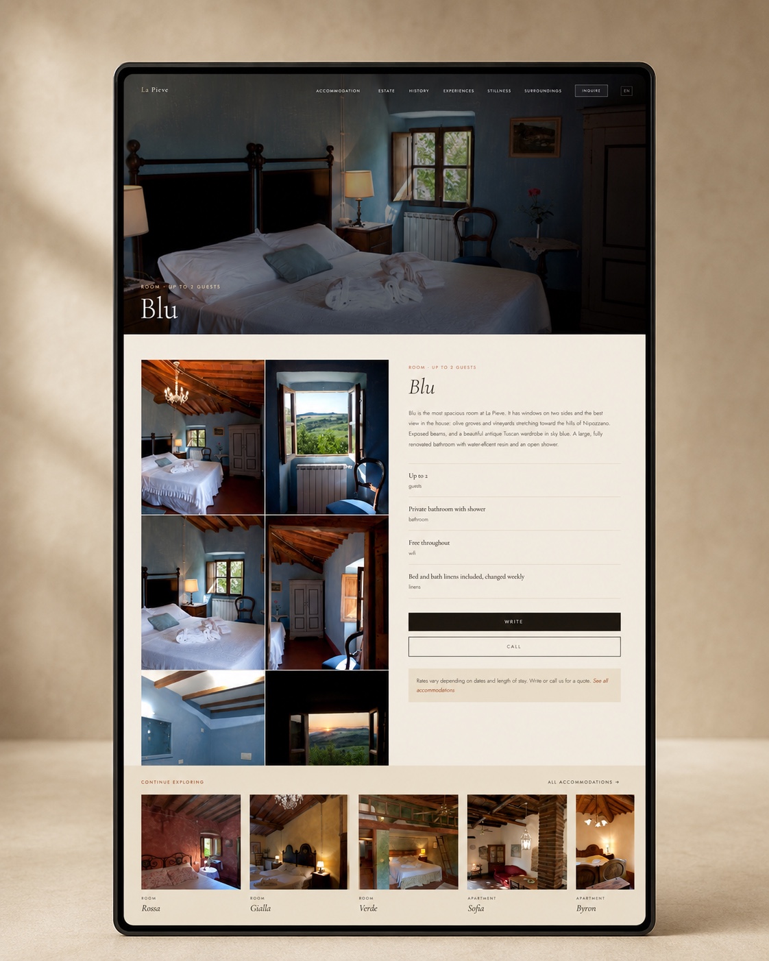
A place that finally feels online like it does in person.
Website · Brand · Content
Scroll
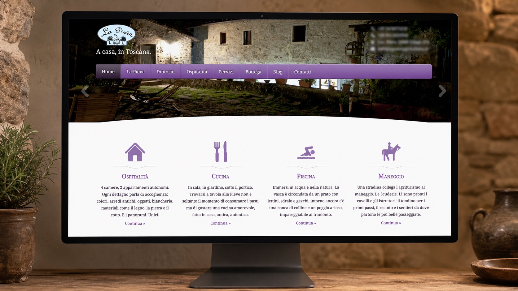
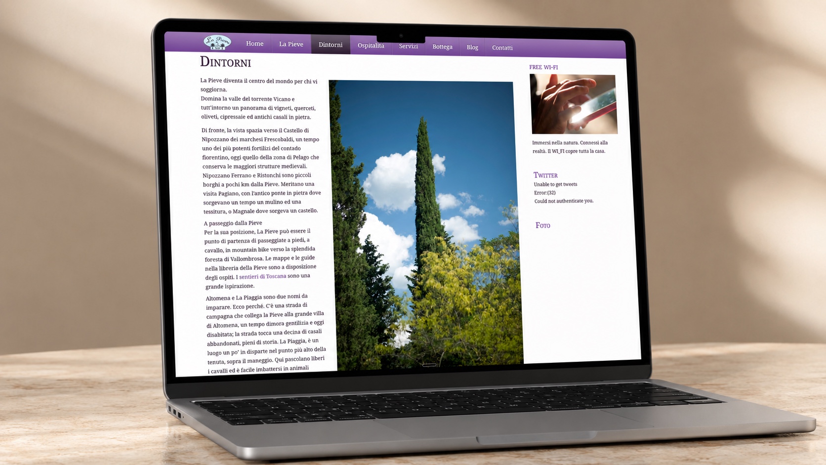 BEFORE
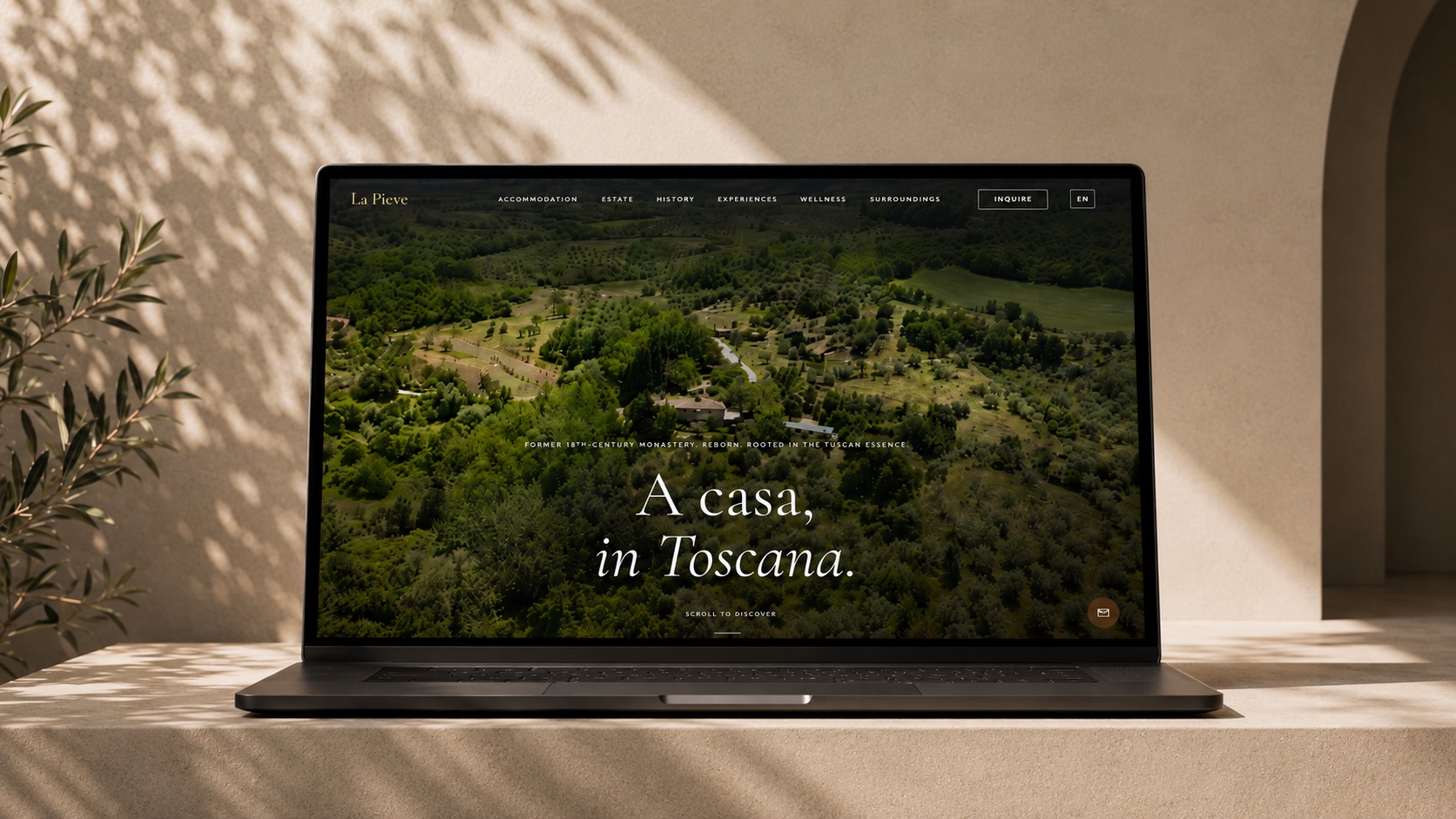
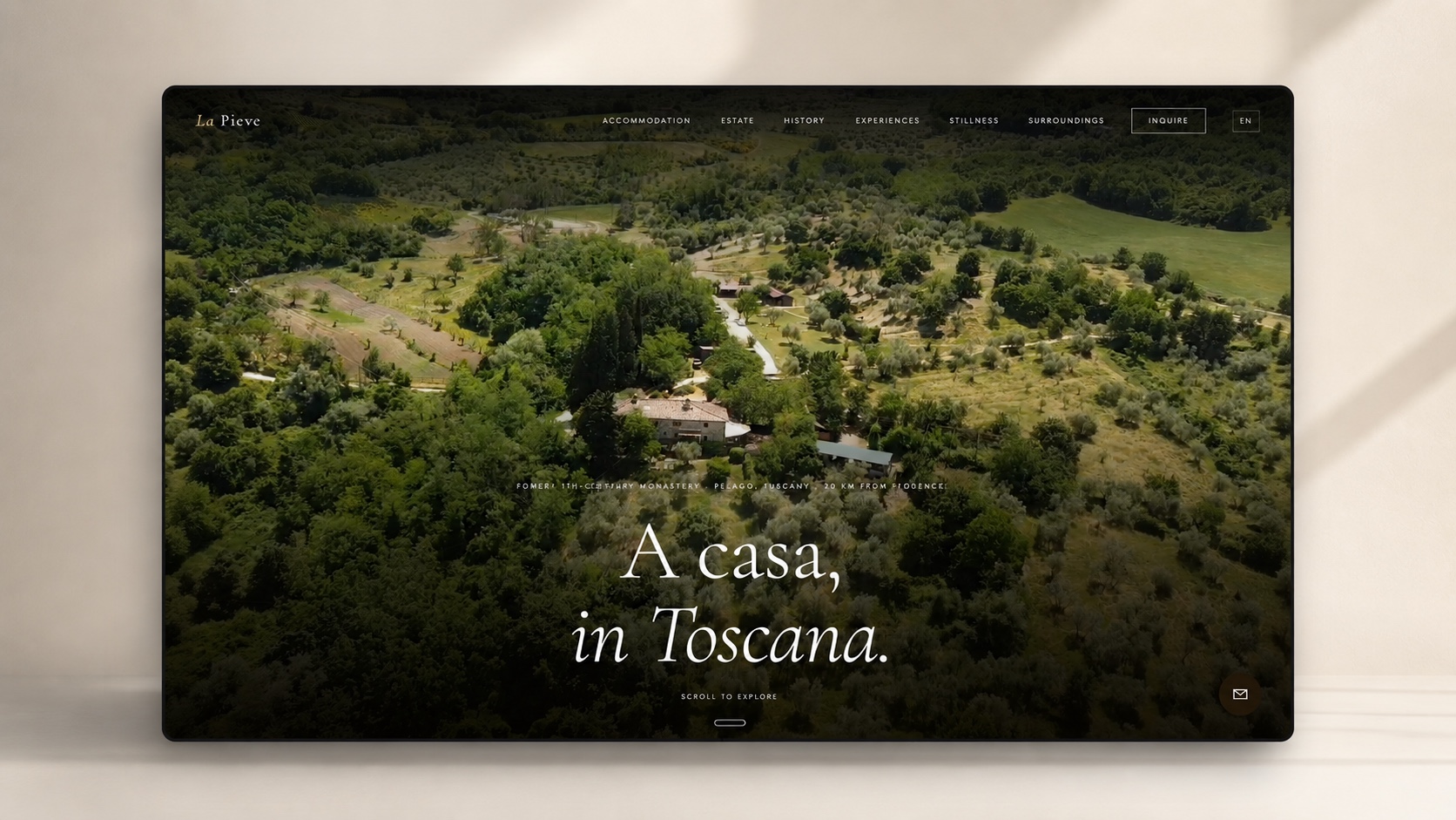 AFTER
AFTERWhat we found
The moment we walked in.
A beautiful estate with an outdated site that gave away almost nothing. None of the experience came through. Not the place, not the surroundings, not the things to do while you’re there.
The fix
A place that finally feels online like it does in person.
What we built
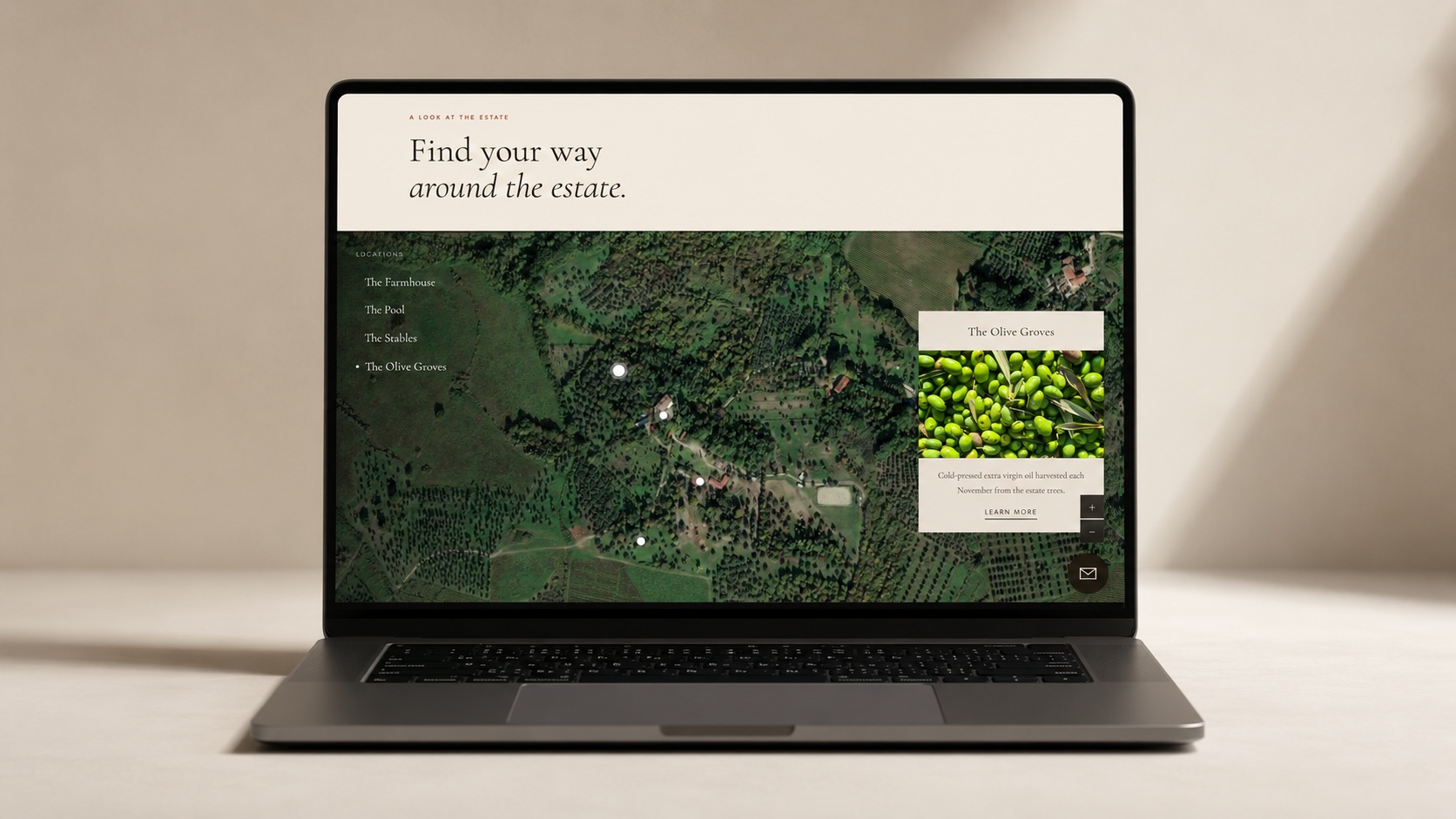
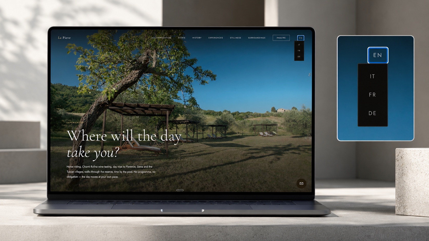
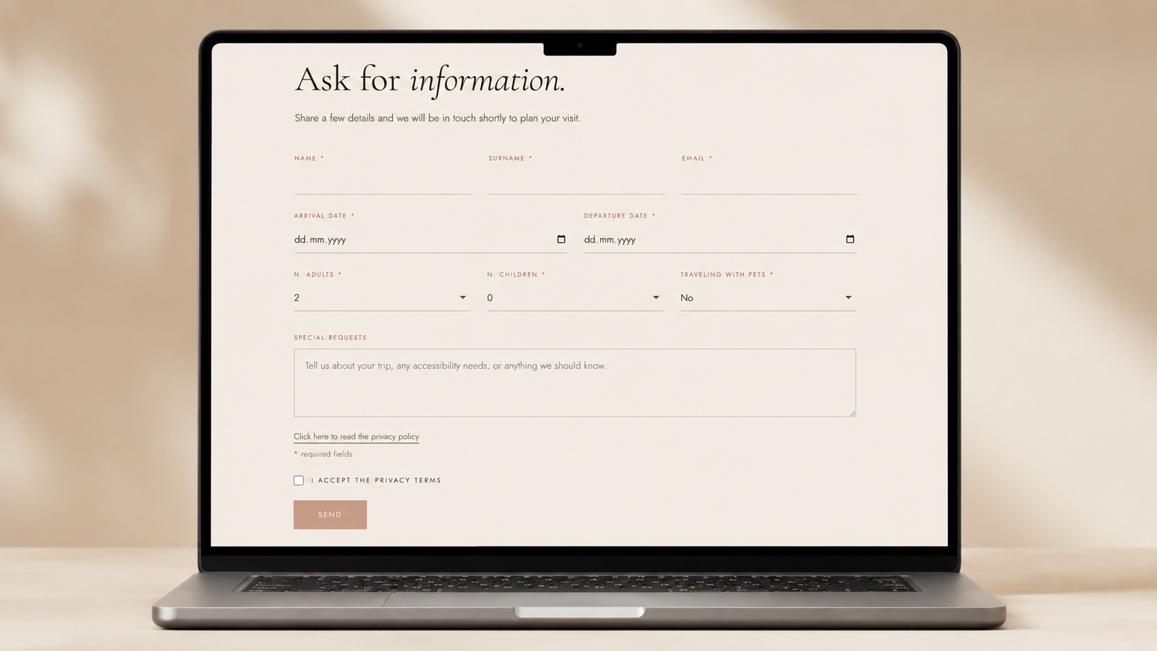
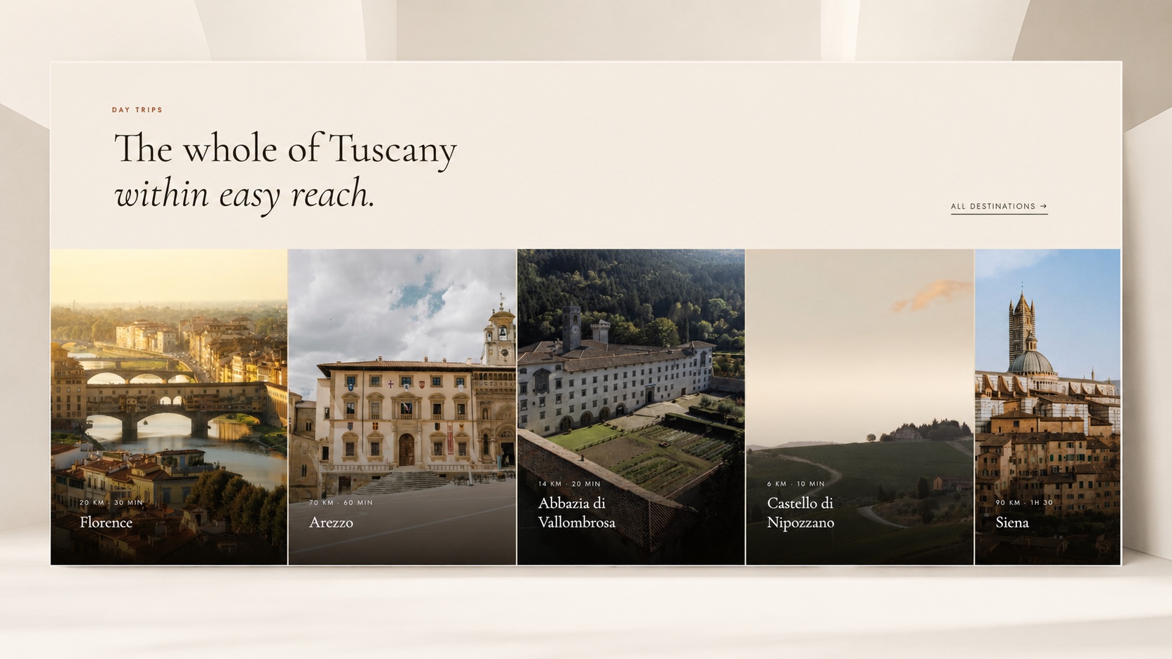
A cinematic site that gives you the full picture before you arrive. Warm Tuscan colours, slow scrolling, real photography, and a map to explore the estate and what’s around it.
What changed